sketch, sketch, sketch
I know, it's been a while. Last semester, the students did great podcasts. That is, great for their skill and prep time. So I'm dropping the idea of doing a podcast theme.
This week, I had the biggest breakout in slide design for a scientific talk. I included sketches for abstract diagrams, instead of drawing them using vector graphics. I love the result, and so did my client and the audience. It made the slides for personal, it freed me the slideware technology, and opened a whole new world of possibilities.

What also surprised me was how I could use vector graphics and sketches in the same slide. Here is another example:
 The incredible thing is I don't know how to sketch! All I did was boxes, lines, triangles and circles. But now, I what to learn more about sketching!
Now I didn't sketch all of the diagrams. I downloaded some vector graphics, and use line style that emulates a brush or a fountain pen:
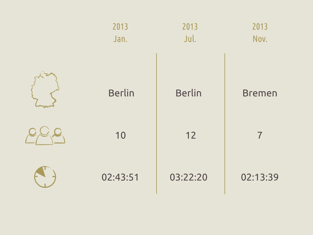
Now, let me stop here for a moment and compare this slide with this one:
 Not only less is more, but using outlines instead for color-filling, I got a more consistent style across my visuals. The former slide uses less ink. Lets break it down:

This week, I had the biggest breakout in slide design for a scientific talk. I included sketches for abstract diagrams, instead of drawing them using vector graphics. I love the result, and so did my client and the audience. It made the slides for personal, it freed me the slideware technology, and opened a whole new world of possibilities.


Now I didn't sketch all of the diagrams. I downloaded some vector graphics, and use line style that emulates a brush or a fountain pen:
 |
| Icons from the noun project. Creative commons. |

- The calendar icons are gone.
- The icons are only outlined.
- Horizontal lines are gone.
- The font style changed from bold to regular.


Comments
Post a Comment